Technical Analysis In Day Trading

Learn how to analyze stock charts and patterns to make informed trading decisions.

Chart Patterns: The Language of the Stock Market

Chart Patterns

Technical analysis helps you read stock charts and spot patterns that guide trading decisions. By learning chart patterns, you can understand market sentiment and predict where prices may move next. This is essential for traders looking to act on short term equity tips.

Trend Lines

A trend line is a straight line that connects two or more price points and extends into the future to act as a line of support or resistance.

Imagine the stock of XYZ Corp is trending upwards on a daily chart. By connecting the lows of the candlesticks, you create an ascending trend line that has acted as support for the price on several occasions.

Support and Resistance Levels

Support and resistance levels help identify where prices may reverse or pause

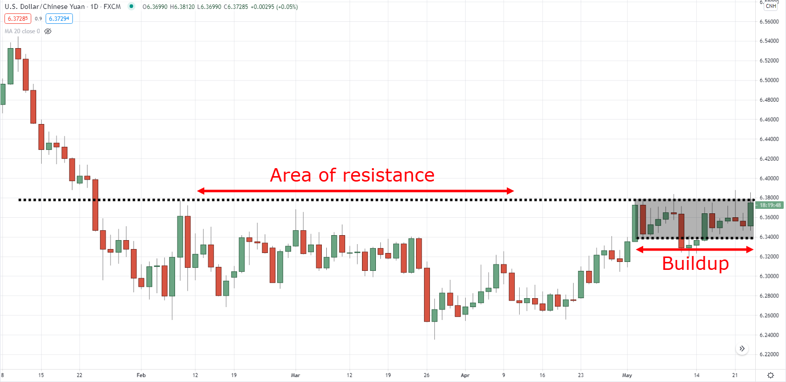
Support and resistance levels help you spot where prices may turn. Support is a price level where demand is strong enough to stop a downtrend. Resistance is where supply is strong enough to stop an uptrend.

For instance, if ABC Ltd has bounced off the $50 level multiple times in the past months, that level is considered a strong support. Conversely, if it has struggled to break above the $60 level, that's considered a strong resistance.

Moving Averages

Moving averages help identify the direction of a trend

Moving averages smooth out price data into a single flowing line. This makes it easier to see the direction of a trend. The most common types are the simple moving average (SMA) and the exponential moving average (EMA).

The 50-day EMA of DEF Inc. has just crossed above its 200-day EMA, a bullish signal known as a "Golden Cross," suggesting a potential long position.

Volume Analysis

Volume Analysis

Volume analysis looks at how many shares are traded during a set period. High volume means strong interest in a stock and often comes before big price moves.

GHI Corp's stock breaks above a resistance level on significantly higher volume than previous days, indicating a strong likelihood that the breakout will sustain.

Candlestick Patterns

Candlestick patterns help predict future price direction

Candlestick patterns help predict where prices may go next. Popular patterns include the Doji, Hammer, Shooting Star, and Engulfing patterns.

A "Doji" forms on JKL Ltd's chart after a prolonged uptrend, suggesting indecision among traders and the potential for a reversal.

Chart Patterns

Chart patterns such as Head and Shoulders, Triangles, Flags, and Pennants can signal continuations or reversals in the market.

MNO Inc. forms a "Head and Shoulders" pattern, indicating that after the completion of the pattern, a reversal from the previous uptrend is likely.

Fibonacci Retracement

Fibonacci retracement levels are horizontal lines that show where support and resistance may appear. They are based on key numbers from mathematician Leonardo Fibonacci in the 13th century.

PQR Ltd's stock retraces to the 61.8% Fibonacci level after a significant rally, providing a potential entry point for traders looking to join the uptrend.

Oscillators and Indicators

Oscillators and indicators such as the Relative Strength Index (RSI), Stochastic Oscillator, and MACD help identify overbought or oversold conditions.

The RSI of STU Inc. is above 70, indicating that the stock might be overbought and could be due for a correction or pullback.

Elliot Wave Theory

The Elliot Wave Theory suggests that markets follow a predictable five-wave pattern of three steps forward and two steps back.

VWX Corp's stock price seems to be completing the fifth wave of an Elliot Wave pattern, suggesting that a downward ABC correction might follow.

Gann Angles

Developed by W.D. Gann, Gann angles are a form of technical analysis based on the idea that the market is geometric and cyclical in nature.

YZA Corp's stock price is moving along a 1x1 Gann angle, which means it's rising at a 45-degree angle, considered a balanced time-price relationship.

Mastering these technical analysis tools gives you a deeper understanding of the market and helps you make informed trading decisions. Remember, no single tool works every time. Using multiple indicators together gives you a clearer picture.

How to Analyze Stock Charts: A Step-by-Step Framework

To analyze stock charts effectively, start by identifying the overall trend direction using higher time frames such as daily or weekly charts, then apply tools like trend lines, support and resistance levels, and volume confirmation to assess price action. This process combines visual pattern recognition with quantitative indicators to evaluate whether a stock is in an uptrend, downtrend, or range-bound phase.

Technical analysis is the study of historical price data, trading volume, and chart patterns to evaluate a stock's potential future direction. Unlike fundamental analysis which examines a company's financial health, technical analysis focuses on price behavior and market psychology as reflected in stock charts.

What is the first step in analyzing a stock chart?

The first step is to determine the prevailing trend by looking at a higher time frame, typically a daily or weekly chart. Draw trend lines along the swing highs and lows to see whether the stock is making higher highs and higher lows (uptrend), lower highs and lower lows (downtrend), or moving sideways (range-bound).

How do you identify support and resistance levels on a chart?

Support and resistance levels are identified by locating price zones where a stock has reversed direction multiple times in the past. Support is found where buying pressure has previously stopped a decline, while resistance is found where selling pressure has halted a rally. These levels become reference points for entry, exit, and stop-loss placement.

What role does trading volume play in chart analysis?

Trading volume confirms the strength behind a price move. A breakout above resistance on rising volume indicates strong conviction and a higher probability of continuation. Conversely, a breakout on low volume suggests weak interest and a greater chance of a false move or reversal.

How can candlestick patterns help in stock chart analysis?

Candlestick patterns reveal the battle between buyers and sellers within a single trading period. Individual candles show the open, high, low, and close price, while multi-candle formations such as the bullish engulfing pattern or bearish harami can signal potential reversals or continuations when combined with support and resistance levels.

What is the best time frame for a beginner learning how to analyze stock charts?
A daily chart is the most suitable time frame for beginners because it provides enough data points to identify clear trends and patterns without the noise and volatility of intraday charts.
How many indicators should you use when analyzing a stock chart?
Using two to three complementary indicators, such as a moving average, RSI, and volume, is sufficient. Overloading a chart with too many indicators can create conflicting signals and analysis paralysis.
Can stock chart analysis guarantee accurate price predictions?
No form of analysis can guarantee price predictions. Technical analysis provides probabilities and risk-assessment frameworks, not certainties. Using stop-loss orders and position sizing is essential to manage the inherent uncertainty.
How often should you review and update your stock chart analysis?
You should review your analysis at the end of each trading session or whenever a stock reaches a key support or resistance level. Frequent review ensures that your read of the chart aligns with the latest price action and volume data.
Do chart patterns work the same way in all market conditions?
Chart patterns tend to be more reliable in trending markets and less reliable in highly volatile or choppy sideways conditions. Always consider the broader market context and use volume as a confirmation tool.
What is the difference between analyzing stock charts for short-term trading versus long-term investing?
Short-term traders focus on lower time frames such as hourly or 15-minute charts and prioritize candlestick patterns and momentum indicators, while long-term investors use weekly and monthly charts to assess macro trends, support and resistance zones, and moving averages.
Scroll to Top